By Sean Tinney February 28, 2023
Your sign up form is one of the most important things to consider when planning your email strategy. After all, it’s one of the key steps to growing your email list and generating more leads.
The key to email marketing success is to grow a healthy, permission-based list. This means that your subscribers are opting in to your list because they want to hear from you. And when a subscriber opts in to your list, they’re more likely to be engaged with your emails.
But you can’t just throw up a sign up form and expect to see your subscribers grow from day one. There are a few best practices that you need to follow to ensure your email sign up form grabs the attention of a potential subscriber and leads to a subscribers for life.
Tips for creating your first sign up form
Email is one of the best ways to connect with your customers and build stronger relationships. And it all starts with a strong sign up form. Use all of these tips when creating your first email sign up form.
1. Be crystal clear what they are signing up for
Your sign up form should be easily understood and tell subscribers exactly what they’re signing up for.
It should include a clear benefit of signing up, including what subscribers should expect to receive from you and how often. This can help set expectations up front and reduce the risk of spam complaints or unsubscribes.
The best types of forms are short, clear and concise.
Another way to attract subscribers is to offer a compelling incentive (also known as a lead magnet) as a thank you for signing up. Think of it like a transaction—if a subscriber gives you their email address, they are expecting something in return.
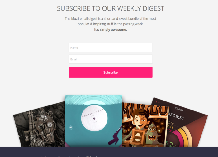
The following example from Muzli, a newsletter for designers, clearly states that subscribers will be signing up for their weekly digest, filled with short and sweet bundle of popular and inspiring stuff from the past week.
2. Create a stand out call to action
A strong call to action (CTA) can help emphasize the importance of signing up for your email list.
Placing some urgency in your CTA can encourage visitors to take action (Think “Join now!” or “Yes, I want in!”). Nobody wants to “sign up” for your email list; they want to opt in to receive valuable content that only you can give them.
Use action words such as:
- Download
- Get
- Submit
- Send
- Start
- Try
- Reserve
- Take
- Upgrade
- Explore
- Save
- Go
And add some excitement in your CTA. If you make it sound exciting, your potential subscribers will also be excited.
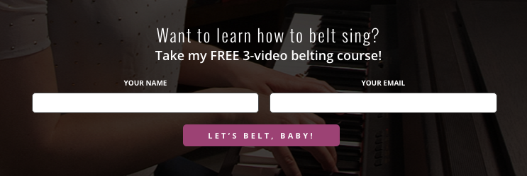
Here’s a fantastic example from Vocal coach Felicia Ricci of a CTA that creates excitement and clearly stands out as something a little different:
3. Limit your ask
Don’t ask for too much information from your subscribers or risk losing their interest.
Keep your fields to a minimum to decrease friction. (The more you ask of someone, the less likely they are to sign up for your emails.)
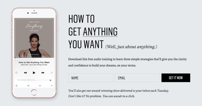
This example from author Marie Forleo keeps it really simple, asking for a subscribers name and email address only.
4. Use contrasting colors
To get more people to notice your form and sign up, it needs to stick out and capture your visitors’ attention. To make this happen, using contrasting color on the website it will be located is key.
Try to establish some level of contrast so that people aren’t blind to it.
“Draw attention to your form by using colors that contrast with the page’s design or changes to the page’s layout pattern to interrupt a viewer’s mental scan of your content. If your page content is two columns, consider interrupting with a full width inline form.”
Jesse Kennedy, AWeber Creative Director
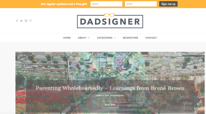
In this sticky horizontal form (aka, one that follows you down the page as you scroll) below, Dadsigner, a design focused lifestyle blog, uses a yellow background and gray button to create contrast for both the form and the call to action button. This contrast catches people’s attention on the predominately white background of the site.
5. Placement, placement, placement
As we just discussed, different types of forms can yield different results so it’s important to keep testing. What might be a high-converting (in this case, conversions referring to sign ups) placement for someone else might not work for you.
A good rule of thumb is to find the most noticeable yet natural placement that doesn’t interrupt the experience someone has with your site.
Whether you go for a pop-up, slide-in, exit intent or a classic embedded form, always test to see what types of forms your audience responds well to. (This goes for different pages of your site, as well.)
The sign up form on our blog post is a perfect example, we tested different locations and found a location to the left of the content performed the best.
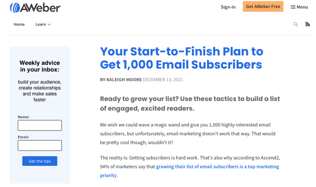
Related: Your start-to-finish plan to get 1,000 email subscribers
6. Immediate confirmation
Fantastic, you’re on your way to setting up a high converting sign up form. You just have one more step to complete to make sure the email addresses you collect are high quality – set up your confirmation email.
A confirmation email is an email which is automatically sent once a subscriber signs up for your list. There are a few reasons a confirmation email is important:
- Reassures your new subscriber that you have received their information.
- Strengthens your future email deliverability by verifying the email provided is correct.
- Improves your future opens and clicks because if a subscriber takes the extra step to confirm their email, they will be more engaged.
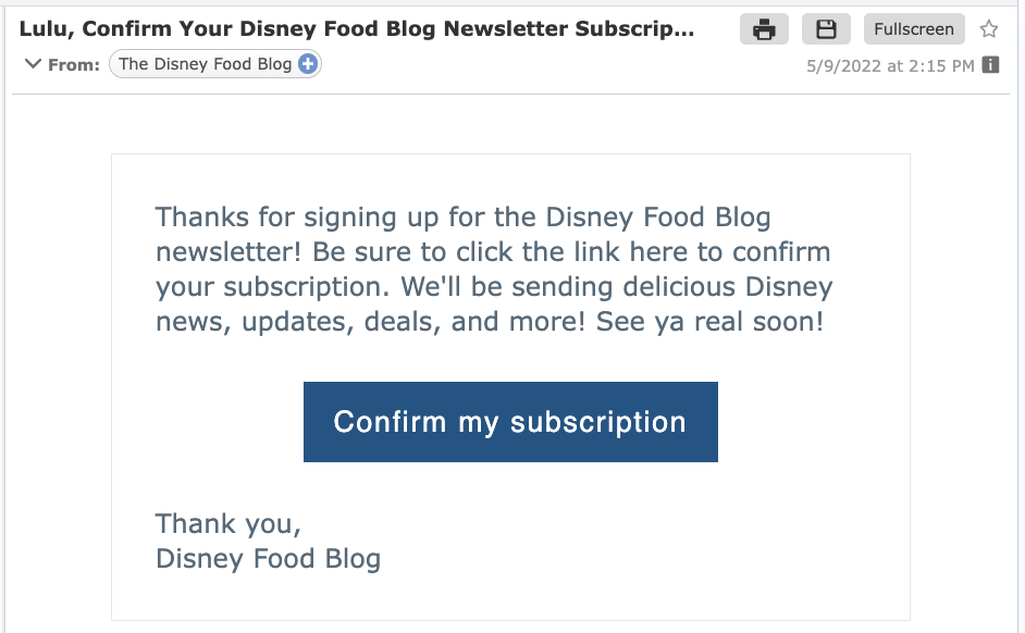
Your confirmation email should thank the subscriber for signing up and asking them to click a link to confirm their subscription. This double-opt in confirmation, verifies they indeed want to receive future content from you.
Here’s a perfect example of a confirmation email from The Disney Food Blog:
7. Test and test again and again
Once you create your sign up form and have it added to your site you’ll start getting subscribers.
But is this form generating as many subscribers as it can be?
That’s where split testing comes in. Split testing gives you the opportunity to compare two different variations of the form to see what your audience responds to best.
Split testing is a great way to optimize your form and to understand your customers better. For example, you may learn that your customers tend to sign up at a higher rate with a yellow CTA button than a blue button.
If you change to the optimized button color — in this case the yellow button — more folks visiting your site will join your list. A subtle change like this will lead to building your email list faster.
Here are a few ideas that you may consider testing:
- Location of your form
- Color of your call to action button
- Any copy on the form
- Include an image
- White background or color background
Remember, testing it is not a one time thing. You should constantly be testing different elements and locations of your sign up form. Have an idea? Then test it.
Create your first sign up form
It’s time to take these tips and apply them to your sign up form. These tips can be applied to any form builder, we’ll show you in 3 easy steps how to build a form using AWeber.
If you don’t already have one, you’ll need to sign up form an AWeber account. You can start off by creating a free account.
Step 1: Select where form will be located
If you have a website where you will be adding the form then select “For My Website”. If you don’t have a website, you can have the form included on a customized landing page built in your AWeber account.
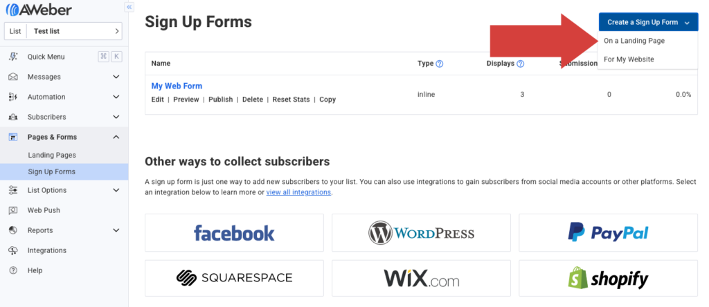
Step 2: Design your sign-up form
Start with one of the predesigned templates and start customizing it by changing the colors, adding your headline and copy, updating the call to action, and adding fields for which information you’d like to collect.
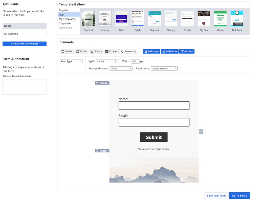
Check out this short video to see how quick and easy it is to design your form using AWeber.
Step 3: Add your form to your website
Once your form is created, you’re going to publish the form on your website or landing page.
If you have a WordPress site you can download the AWeber plugin. Or you can either install the HTML code on your website or use the form as a landing page.
What’s Next
Have you used any of these strategies? How are they working for you? Let us know in the comments!


