When people arrive on your Facebook page, where do you think they’ll look first? It takes up almost a quarter of the screen on most desktop browsers. That’s right — it’s your Facebook cover photo.

The cover photo for your Facebook business page sets the tone for visitors. In this post, you’ll learn Facebook cover photo best practices with real-world examples of each tip we recommend.
To get started, let’s dive into Facebook cover photo dimensions.
Facebook Cover Photo Size
Facebook cover photos are 851 pixels wide and 315 pixels tall for desktops, and 640 pixels wide by 360 pixels tall for mobile. The photo should be less than 100 kilobytes. If your uploaded image is smaller than these dimensions, Facebook will stretch it to fit, making it appear blurry.
The right image can signal that your page is an inviting community, not just a boring string of updates. Knowing how to create your Facebook cover photo is essential to the success of your page.
Sometimes called your Facebook banner, this graphic is one of the most noticeable parts of your page. You’ll want a crystal-clear image that accurately reflects the goals of your business. Having the correct dimensions makes all the difference.

Facebook sets specific dimensions for cover photos to create a standard look across all pages, no matter what device they’re viewed on. You’ll want to follow Facebook cover photo best practices and optimize for the correct dimensions.
Considering the Facebook cover photo dimensions above, balancing creativity with the platform’s requirements can be tough. Mobile and desktop screens have different requirements. These devices will display the same cover photo differently.
Here’s what to look for when optimizing your cover photo for mobile and desktop devices.
How do Facebook cover photos appear on mobile vs. desktop screens?
Mobile devices display a smaller version of the cover photo than a desktop screen. As you can see, there’s a lot of space around the perimeter of the photo that could be cut off when a visitor is viewing your photo on a mobile screen.
You’ll want to make sure that the most important part of your images isn’t cropped on mobile. Take this into consideration when you create your design.
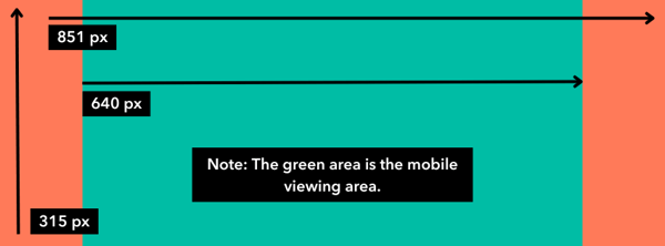
Therefore, it’s best to place the important parts of your content in the green space. Doing this will ensure everyone can see your cover photo properly regardless of the device they use.
Here’s an example from HubSpot’s own Facebook cover photo. This is what our cover photo looks like on desktop:

And this is what the cover photo looks like on mobile:

Notice how the alignment and viewing area are different, but all the content is displayed in both.
Need help getting started? Below, you’ll find Facebook cover photo templates and best practices to guide you when designing your brand’s cover photo artwork.
How to Design a Facebook Cover Photo
- Abide by Facebook’s cover photo guidelines.
- Make sure your Facebook cover photo is the right size.
- Don’t worry about the “20% text” rule.
- Give your cover image a focal point.
- Make sure your profile picture compliments your cover photo.
- Draw attention to the action buttons on the bottom right.
- Right-align the objects in your cover photo.
- Keep mobile users in mind.
- Include a shortened link in your cover photo description that aligns with your page CTA.
- Pin a related post right below your Facebook cover image.
1. Abide by Facebook’s cover photo guidelines.
It seems like a no-brainer, but following Facebook’s cover photo guidelines is the first step to keeping your page visible on the platform. I’d suggest reading through the full Page Guidelines, but here are a few important things to keep in mind for your Facebook cover photo:
- Your cover photo is public.
- Cover photos can’t be deceptive, misleading, or infringe on anyone else’s copyright.
- You can’t encourage people to upload your cover photo to their personal timelines.
If caught violating the above terms, Facebook could take action against your page. Your social presence is important. You’ll want to avoid any cover photo infractions at all costs.

Pro tip: Use images that you’ve taken of your products, opt for all text, or use stock photos you’ve licensed to avoid copyright infringement.
2. Make sure your Facebook cover photo is the right size.
As I mentioned earlier, the Facebook cover photo size is 851 pixels wide by 315 pixels tall for desktop screens, and 640 pixels wide by 360 pixels tall on mobile screens.
If you upload an image smaller than those dimensions, Facebook will stretch it to fit the space. If the image is larger, Facebook will have to cut it down and may only display a third of the image you designed.
Designing the perfect cover photo takes time. The last thing you want is for your hard work to be truncated or distorted.
If you want a no-hassle way to make sure your cover photos are the right size, download our pre-sized template for Facebook cover photos.

Download Facebook Cover Templates
3. Don’t worry about the “20% text” rule.
Back in 2013, Facebook removed all references to the 20% rule on text in cover photos, but that doesn’t mean you should use a lot of text in your design.
The previous rule stated that only 20% of a cover photo could display text. Although this rule might sound restrictive, its sentiment has merit — you want your visitors engaged with visuals, not a wall of text.
If you use text in your cover photo, keep it concise and let the imagery speak for itself. You can see how we struck this balance on HubSpot’s Facebook page below.

For more cover photo inspiration, check out our Facebook page.
4. Give your cover image a focal point.
Think of your cover photo as the portion of your page that’s “above the fold.” If it’s distracting or confusing, people will be more likely to click off the page.
Many of the best Facebook cover photos include a focal point and a color scheme that aligns with the rest of the brand. Remember, your social media accounts are extensions of your business, and they should make a good first impression on visitors.
Great Facebook cover photos also have ample negative space to make the subject, the copy, and the elements unique to Facebook (like the call-to-action [CTA] button on Facebook business pages) stand out even more.
Here’s an example of good use of negative space from The New York Times:

And here’s another example from social media management platform Sprout Social.

5. Make sure your profile picture compliments your cover photo.
For businesses, profile pictures are completely separate from the cover photo. These two images will not overlap.
Keep this in mind when making your design. These images should have similar color schemes or contrasting patterns, while still following your brand’s guidelines.
Take a look at the Anthropology Facebook page below. The yellow in the profile picture stands out from the cover photo while complementing the overall color scheme.

6. Draw attention to the action buttons on the bottom right.
In a few of the cover photo examples above, you may have noticed that the primary CTA buttons were different. HubSpot’s CTA button says “Send Message,” while Sprout Social’s says “Sign Up.”
Depending on your business, you can launch a page on Facebook with a unique CTA button to the bottom right of your cover photo. Take the placement of this button into consideration when designing your cover photo.
LinkedIn Learning does this in a subtle way below, placing the graphic of a person on a laptop over the “Sign Up” button, drawing your eye to that blue CTA.

Note: While it might seem like a good idea to add directional cues like an arrow to get people to click on the CTA buttons, note that those CTA buttons don’t appear the same way on the mobile app. Instead opt for more subtle ways to highlight that button, like on the page above.
7. Right-align the objects in your cover photo.
Since your profile picture is on the left, you want to add some balance to your Facebook cover photo design by placing the focus of the image on the right.
Take a look at these cover photos. Which one looks more aesthetically pleasing?
Right-aligned focus.
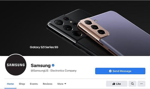
Left-aligned focus.

Doesn’t the right-aligned cover photo look a lot better? In Samsung’s new cover photo, the biggest design elements (the profile picture, the text, and the two phones) are evenly spaced.
In Samsung’s old cover photo, your attention immediately goes to the left side of the Facebook page, causing you to miss the product’s name on the upper-right side.
Adding balance to a layout is a crucial element of design. This technique allows your cover photos to be more visually effective on mobile.
8. Keep mobile users in mind.
Statista reports that 98.5% of Facebook’s user base accesses the social network from mobile devices like smartphones and tablets. That’s exactly why it’s so important to keep mobile users top-of-mind when designing your Facebook cover photo.
On mobile, a much smaller portion of the cover photo is visible. The right side is typically cut out entirely.
Let’s take a look at what Cisco’s Facebook page looks like on a desktop browser versus Facebook’s mobile app.
Desktop:

Mobile:

It’s important to note that the text in Cisco’s cover photo doesn’t appear in the mobile version. While right-aligned visual elements look great, be careful not to put important content so far to the right that it gets cut off when viewed on a mobile device.
9. Include a shortened link in your cover photo description that aligns with your page CTA.
If you want to use your cover photo to support a page CTA, ensure your cover photo description includes a text CTA and links to the same offer. This way, whenever people view your cover photo by itself, they can still access the link.
Here’s this practice in action on the Adobe Creative Cloud Facebook page.
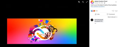
Pro tip: Shorten your links and add UTM codes to track the visitors who click the link in the description. Shortening and tracking features are available in HubSpot’s Marketing Hub and with tools like Bitly.
(If you want to learn more about how to write effective call-to-action copy for your cover photo description, download our free ebook on creating compelling CTAs.)
10. Pin a related post right below your Facebook cover image.
Pinning a post allows you to highlight a typical Facebook post at the top of your Timeline. It’s signified by a PINNED POST title on the top right of the post, like on Behance’s page below.
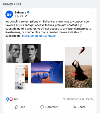
You’ve already spent time aligning your Facebook page CTA, your cover photo design, and your cover photo description copy. You should also make sure to post about the same thing in your timeline and pin that post to reinforce the message.
That way, your visitors have one very clear call to action when they land on your page (albeit in several different locations) — which will give them more opportunities to convert.
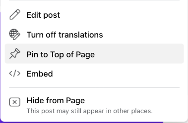
Here’s how to pin a Facebook post:
- Publish the post to Facebook.
- Click the three dots on the top right corner of the post.
- Choose “Pin to Top of Page.”
Facebook Cover Photo Sizes that Work for Your Business
While creating a cover photo may feel simple, the image you choose has a huge image on prospects visiting your page. You want to put your best foot forward on Facebook, and your cover photo is the first thing visitors see.
An ill-fitting cover photo or video can look unprofessional and give the wrong impression about the quality of your offerings.
With the tips in this article, you have the information you need to create a Facebook cover photo that embodies your brand and engages users on the platform.
Editor’s note: This post was originally published in July 2020 and has been updated for comprehensiveness.
Source link


